Scatter View is one of the most important controls of which Microsoft Surface SDK is providing and it enables features like multi usable, multi touchable, moving components here and there, stacking items, resizing, scaling and so on.
Throughout the discussion, we will cover,
1. How we can use Scatter View
2. Change Scatter View Properties
3. Adding Items to Scatter View Programmatically
4. Add Interactive Elements to Scatter View
5. Conclusion
Just start to get things going; let’s create a Microsoft Project in Visual Studio 2010,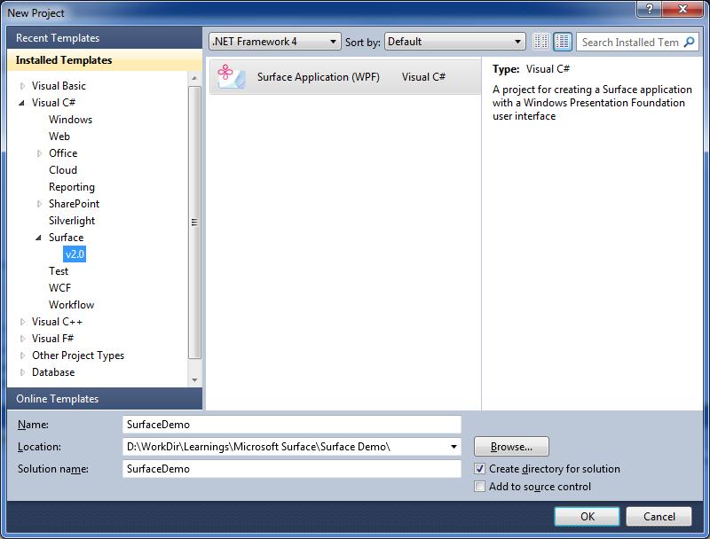
Press OK and then we will get a Project created in VS 2010 named, SurfaceDemo, which is having a Surface Window named “SurfaceWindow1”. This is the XAML we got in SurfaceWindow1.XAML page,
<s:SurfaceWindow x:Class="SurfaceDemo.SurfaceWindow1"
xmlns="http://schemas.microsoft.com/winfx/2006/xaml/presentation"
xmlns:x="http://schemas.microsoft.com/winfx/2006/xaml"
xmlns:s="http://schemas.microsoft.com/surface/2008"
Title="SurfaceDemo"
>
<Grid>
Grid>
s:SurfaceWindow>
Then I will go and add a Sactter View into the Grid inside the grid,
<s:SurfaceWindow x:Class="SurfaceDemo.SurfaceWindow1"
xmlns="http://schemas.microsoft.com/winfx/2006/xaml/presentation"
xmlns:x="http://schemas.microsoft.com/winfx/2006/xaml"
xmlns:s="http://schemas.microsoft.com/surface/2008"
Title="SurfaceDemo"
>
<Grid>
<s:ScatterView Name="MyScatterView">
s:ScatterView>
Grid>
s:SurfaceWindow>
How we can User the Scatter View
No we can start adding Controls into Scatter View. You can add any of Surface Control into this Scatter view and it will give those controls to the behaviors that I mentioned earlier. Let’s start the with an Image, that the perfect example we show most of the features of Scatter View. Instead of one image we will add the set of images from one of my image folders, and we are going to add the images at the run time too.
Here is the Scatter XAML code we need for our purpose, means how it’s look like the Scatter View SurfaceWindow1.xaml file,
<s:ScatterView Name="MyScatterView">
<s:ScatterView.ItemTemplate>
<DataTemplate >
<Image Source="{Binding}"/>
DataTemplate>
s:ScatterView.ItemTemplate>
s:ScatterView>
Then in the code behind file, we have to bind the list of image into Scatter View to show them in the window,
public SurfaceWindow1()
{
InitializeComponent();
// Add handlers for window availability events
AddWindowAvailabilityHandlers();
//Add Images into Sctter View
MyScatterView. ItemsSource = System.IO.Directory.GetFiles(@"D:\WorkDir\Learnings\Microsoft Surface\Photos", "*.jpg");
}
Here what we are doing is that, just adding my mages list into scatter view item source,
Here is how output is looks like after hitting F5,
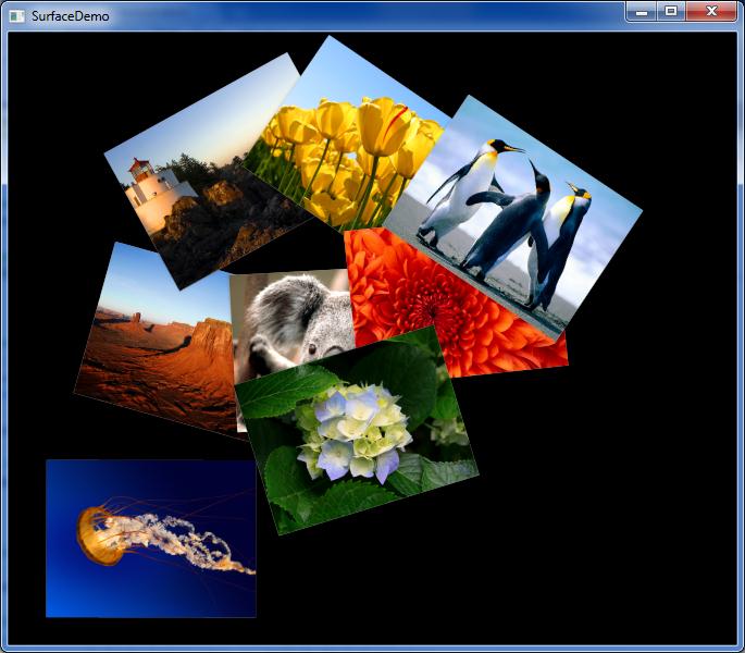
Now you can start playing with these images by using your mouse. You should be able to drag them here and there and change the angle the way you need and etc. But to test multi User and Multi Touch capabilities, you need to use the Windows 7 Input Simulator.
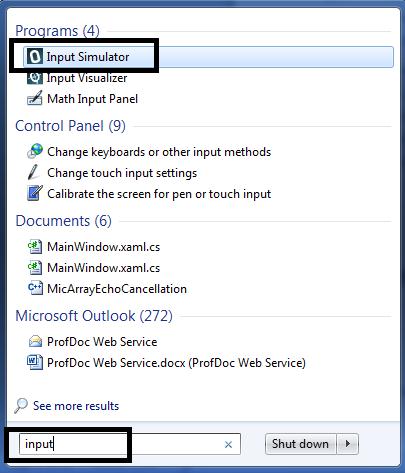
To Start the Input Simulator, just type input in “Run” command box, at the bottom of Windows Start Menu, then you will see the Input Simulator and just click on it.
Throughout the discussion, we will cover,
1. How we can use Scatter View
2. Change Scatter View Properties
3. Adding Items to Scatter View Programmatically
4. Add Interactive Elements to Scatter View
5. Conclusion
Just start to get things going; let’s create a Microsoft Project in Visual Studio 2010,
Press OK and then we will get a Project created in VS 2010 named, SurfaceDemo, which is having a Surface Window named “SurfaceWindow1”. This is the XAML we got in SurfaceWindow1.XAML page,
<s:SurfaceWindow x:Class="SurfaceDemo.SurfaceWindow1"
xmlns="http://schemas.microsoft.com/winfx/2006/xaml/presentation"
xmlns:x="http://schemas.microsoft.com/winfx/2006/xaml"
xmlns:s="http://schemas.microsoft.com/surface/2008"
Title="SurfaceDemo"
>
<Grid>
Grid>
s:SurfaceWindow>
Then I will go and add a Sactter View into the Grid inside the grid,
<s:SurfaceWindow x:Class="SurfaceDemo.SurfaceWindow1"
xmlns="http://schemas.microsoft.com/winfx/2006/xaml/presentation"
xmlns:x="http://schemas.microsoft.com/winfx/2006/xaml"
xmlns:s="http://schemas.microsoft.com/surface/2008"
Title="SurfaceDemo"
>
<Grid>
<s:ScatterView Name="MyScatterView">
s:ScatterView>
Grid>
s:SurfaceWindow>
How we can User the Scatter View
No we can start adding Controls into Scatter View. You can add any of Surface Control into this Scatter view and it will give those controls to the behaviors that I mentioned earlier. Let’s start the with an Image, that the perfect example we show most of the features of Scatter View. Instead of one image we will add the set of images from one of my image folders, and we are going to add the images at the run time too.
Here is the Scatter XAML code we need for our purpose, means how it’s look like the Scatter View SurfaceWindow1.xaml file,
<s:ScatterView Name="MyScatterView">
<s:ScatterView.ItemTemplate>
<DataTemplate >
<Image Source="{Binding}"/>
DataTemplate>
s:ScatterView.ItemTemplate>
s:ScatterView>
Then in the code behind file, we have to bind the list of image into Scatter View to show them in the window,
public SurfaceWindow1()
{
InitializeComponent();
// Add handlers for window availability events
AddWindowAvailabilityHandlers();
//Add Images into Sctter View
MyScatterView. ItemsSource = System.IO.Directory.GetFiles(@"D:\WorkDir\Learnings\Microsoft Surface\Photos", "*.jpg");
}
Here what we are doing is that, just adding my mages list into scatter view item source,
Here is how output is looks like after hitting F5,
Now you can start playing with these images by using your mouse. You should be able to drag them here and there and change the angle the way you need and etc. But to test multi User and Multi Touch capabilities, you need to use the Windows 7 Input Simulator.
To Start the Input Simulator, just type input in “Run” command box, at the bottom of Windows Start Menu, then you will see the Input Simulator and just click on it.
Input Simulator
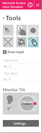
Just Click on the finger box in command window, then you will get your mouse pointer, which is most like a vertical rectangle, which is having curved edges. First Just click images with it, then you will see the reflections from the images. To play with the image, first click Left mouse button and while it is pressed, just click the right mouse button too, then you will get a fix clicked, like pined point in picture.
Then just go to other corner of the image, click left mouse button and while it is pressed start to move mouse around the window. Now you will find your ways to play with images. With this you should be able to Scale and Rotate the images easily with your mouse.
Change Scatter View Properties
When it’s come to changing properties of Scatter View items, you can,
1. Constraining Manipulations
2. Limiting manipulations
3. Setting Explicit Positions
You can constrain Scatter View Item manipulations by setting,
1. MaxHeight – this is the maximum height of items
2. MaxWidth – this the maximum width of the items
3. MinHeight - minimum height of the items
4. MinWidth – minimum with of the items
5. CanScale – true means can scale items, false means can’t scale items
6. CanRotate - true means can rotate items, false means can’t rotate items
7. CanMove - true means can move items, false means can’t move items
<s:ScatterView Name="MyScatterView">
<s:ScatterViewItem MaxHeight="100" MaxWidth="100" MinHeight="50" MinWidth="50"
CanScale="True" CanRotate="True" CanMove="False">
<Image Source="D:\WorkDir\Learnings\Microsoft Surface\Photos\Koala.jpg" />
s:ScatterViewItem>
s:ScatterView>
There are many numbers of properties; you can change in Scatter view and Scatter view items to make things more usable for your customers. Here I just mentioned few key properties only.
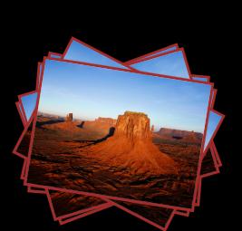
This is a sample Scatter View,
<s:ScatterView Name="MyScatterView">
<s:ScatterViewItem Center="512,384" BorderBrush="Brown" BorderThickness="3">
<Image Source="D:\WorkDir\Learnings\Microsoft Surface\Photos\Desert.jpg"/>
s:ScatterViewItem>
<s:ScatterViewItem Center="512,384" BorderBrush="Brown" BorderThickness="3">
<Image Source="D:\WorkDir\Learnings\Microsoft Surface\Photos\Desert.jpg"/>
s:ScatterViewItem>
<s:ScatterViewItem Center="512,384" BorderBrush="Brown" BorderThickness="3">
<Image Source="D:\WorkDir\Learnings\Microsoft Surface\Photos\Desert.jpg"/>
s:ScatterViewItem>
<s:ScatterViewItem Center="512,384" BorderBrush="Brown" BorderThickness="3">
<Image Source="D:\WorkDir\Learnings\Microsoft Surface\Photos\Desert.jpg"/>
s:ScatterViewItem>
<s:ScatterViewItem Center="512,384" BorderBrush="Brown" BorderThickness="3">
<Image Source="D:\WorkDir\Learnings\Microsoft Surface\Photos\Desert.jpg"/>
s:ScatterViewItem>
<s:ScatterViewItem Center="512,384" BorderBrush="Brown" BorderThickness="3">
<Image Source="D:\WorkDir\Learnings\Microsoft Surface\Photos\Desert.jpg"/>
s:ScatterViewItem>
s:ScatterView>
And output is like this,
You can use ItemContainerStyle property to change the properties of Scatter View Container Items,
<s:ScatterView>
<s:ScatterView.ItemContainerStyle>
<Style TargetType="{x:Type s:ScatterViewItem}">
<Setter Property="Center" Value="512,384"/>
<Setter Property="BorderBrush" Value="White"/>
<Setter Property="BorderThickness" Value="3"/>
Style>
s:ScatterView.ItemContainerStyle>
<Image Source="Desert.jpg"/>
<Image Source="Desert.jpg"/>
<Image Source="Desert.jpg"/>
<Image Source="Desert.jpg"/>
<Image Source="Desert.jpg"/>
<Image Source="Desert.jpg"/>
s:ScatterView>
Add Items to Scatter View Programmatically
Instead of doing things with Scatter View in XAML, developers can do the same, more dynamically by programming. You have access to all the properties of Scatter View, in programmatically, as you do in XAML, in statically. Whatever you do in XAML will reflect in output in static way, but whenever you need things to be more dynamic, then the option is obvious, you have to do it in programmatically.
For an Example you can take photo application I created at the first phase of the article, there we take the images from folder and populate them in Scatter View, as Scatter View Items, dynamically.
XAML
<s:ScatterView Name="MyScatterView">
<s:ScatterView.ItemTemplate>
<DataTemplate >
<Image Source="{Binding}"/>
DataTemplate>
s:ScatterView.ItemTemplate>
s:ScatterView>
public SurfaceWindow1()
{
InitializeComponent();
// Add handlers for window availability events
AddWindowAvailabilityHandlers();
//Add Images into Sctter View
MyScatterView. ItemsSource = System.IO.Directory.GetFiles(@"D:\WorkDir\Learnings\Microsoft Surface\Photos", "*.jpg");
}
Add Interactive Items to Scatter View
As WPF Panels, Grids and any other container controls, you can add any Surface Controls into Scatter View, in statically or dynamically. For an example, here we are going to add a Surface Button into Scatter View Item template,
<s:ScatterView.ItemTemplate>
<DataTemplate>
<Grid>
<Image Source="{Binding}"/>
<s:SurfaceButton Click="OnItemClicked" Content="Click Me!" Width="100" Height="80"/>
Grid>
DataTemplate>
s:ScatterView.ItemTemplate>
And it is 100% same as normal WPF controls; you can handle any number of events which could occur from these controls.
private void OnItemClicked(object sender, RoutedEventArgs e)
{
// Get the button that was clicked and hide it.
Button b = (Button)e.Source as Button;
b.Visibility = Visibility.Collapsed;
// Get the ScatterViewItem control for the clicked button.
ScatterViewItem item = (ScatterViewItem)scatter.ContainerFromElement(b);
// Get the image within the ScatterViewItemcontrol.
System.Windows.Controls.ContentPresenter content = FindContentPresenter(item);
System.Windows.Controls.Image img =
(System.Windows.Controls.Image)content.ContentTemplate.FindName("img", content);
// Convert the image to grayscale.
img.Source = new FormatConvertedBitmap(
(BitmapSource)img.Source, PixelFormats.Gray16, BitmapPalettes.Gray16, 0);
}
System.Windows.Controls.ContentPresenter FindContentPresenter(DependencyObject obj)
{
for (int i = 0; i < VisualTreeHelper.GetChildrenCount(obj); i++)
{
DependencyObject child = VisualTreeHelper.GetChild(obj, i);
if (child != null && child is System.Windows.Controls.ContentPresenter)
{
return (System.Windows.Controls.ContentPresenter)child;
}
else
{
System.Windows.Controls.ContentPresenter childOfChild =
FindContentPresenter(child);
if (childOfChild != null)
return childOfChild;
}
}
return null;
}
Conclusion
Microsoft Surface is going to be a future technology and it is still maturing. So many features we will see in future than now. This series of articles to be continued with more Microsoft Surface Programming topics and next time it’s gonna be How We can Recognize Physical Objects with Microsoft Surface Programming.
Best Regards
Lakmal
Helpful to get start Thanks for sharing..
ReplyDelete